
Introducing our new visual identity
Discover our new visual identity, a redesign that celebrates 80 years of history with a more contemporary, versatile and authentic image that remains true to our origins.


On the occasion of our 80th anniversary, we are introducing a new visual identity that reflects who we are today and how we look to the future, while staying true to the values that have guided us since the very beginning.
This new chapter marks another step in our evolution, while remaining true to our origins, our commitment to tradition, and the close relationships that have always defined us.
After eight decades of history, we felt it was time for our visual identity to better reflect who we are today.
This redesign stems from that very reflection. Rather than breaking with the past, it builds upon it with a more contemporary, future-ready identity while preserving the elements that make us instantly recognisable.
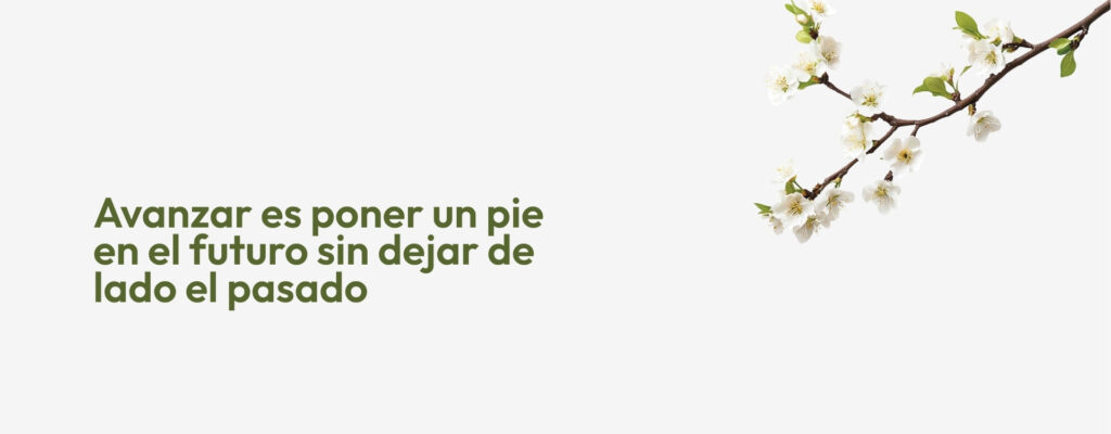

Every element of our new visual identity has been designed to strengthen Manolet’s personality and enhance the way we communicate with the world around us.
From the logo to the typography, the new visual identity embraces a cleaner, more contemporary look.
In addition, the identity’s primary colour is inspired by the green of the almond tree’s leaves, a tribute to our roots and to the natural environment that has accompanied the company’s growth since day one. In this way, this connection with our surroundings reflects our commitment to continue growing without losing sight of what defines us.
With this launch, our new visual identity will be reflected across all our channels, platforms and communications.
An evolution that reflects the way we see the future: moving forward with a renewed visual identity while preserving the tradition and close relationships that have defined our first 80 years and will continue to guide our journey.
Discover our new visual identity, a redesign that celebrates 80 years of history with a more contemporary, versatile and authentic image that remains true to our origins.